OVERVIEW
Migration was Komprise's core revenue driver, and an enterprise account had just named its workflow friction as their churn reason
Komprise helps 50+ enterprise clients, including Nike, Paramount, Pfizer, and Morgan Stanley, reduce storage costs by intelligently tiering and migrating petabytes of unstructured data across hybrid cloud infrastructure. Most core workflows rely on table-based interfaces where IT admins configure and execute actions on large datasets. Bulk action support was inconsistent across the product, with some tables having partial implementations and others none at all. Migration was the highest-impact surface because it was the primary mechanism through which clients achieved the cost savings that justified the entire platform.
The project arrived with concrete stakes. CS had escalated a churn risk to our VP: AHEAD, a significant annual-revenue enterprise account, had cited migration workflow friction as the reason they were evaluating alternatives. Bulk actions was the most visible gap in that workflow, and the VP set it as the quarter's top priority.
TASK COMPLETION SPEED
+90%
Exceeded the 80% target, from 30-40 minutes per session to under 5 minutes
BULK ACTION ABANDONMENT
-95%
Dropped from near 70% pre-execution abandonment to 5% post-launch, well below the 20% goal
CS ESCALATIONS
-62%
Migration workflow tagged tickets decreased over 8 weeks post-launch, validated against stable 6-month baseline with other categories flat
PROBLEM
IT admins were repeating identical actions one by one with no bulk capability or failure visibility
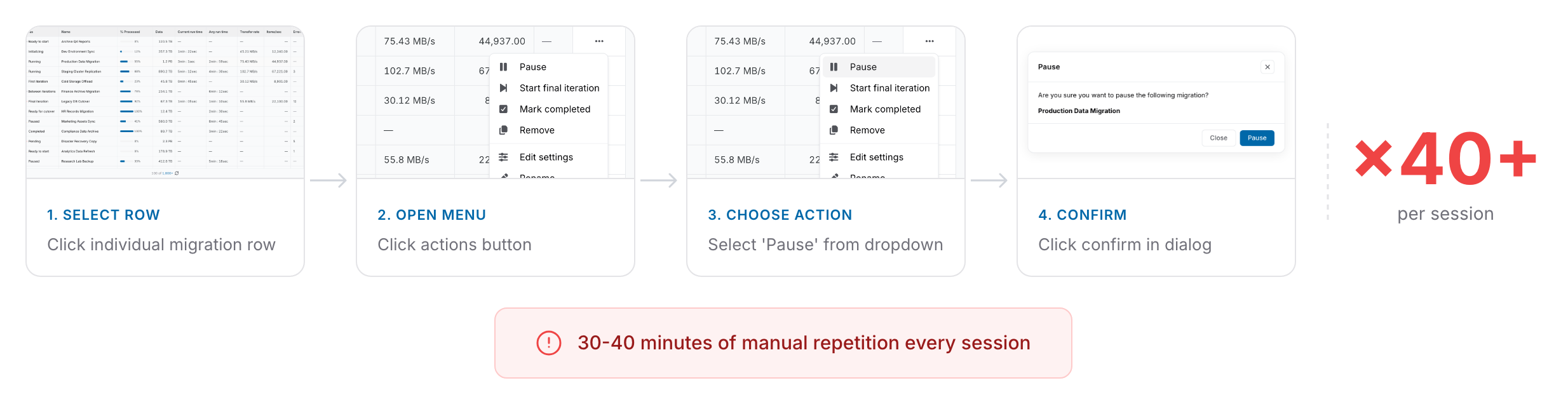
"I just spent 40 minutes clicking the same button 50 times." "I'm afraid to hit execute because I can't see what's actually going to happen." These two quotes from IT admin interviews captured the core frustration. Users spent 30 to 40 minutes per session on tasks that should take minutes, repeating 40 to 50 individual actions with no way to select, confirm, and execute in bulk. When I pulled usage logs and defined the pattern as the same action type triggered more than 10 times sequentially on adjacent rows, 73% of active enterprise accounts (roughly 40 or more accounts with at least weekly migration usage) showed it, confirming this was systemic and not an edge case. The workflow had no bulk capability, no visibility into what was selected, and no clear recovery path when migrations failed.
73% of active enterprise accounts showed the same repetitive action pattern in usage logs
RESEARCH & DISCOVERY
I mapped the funnel and found entry-point confidence, not execution speed, was the real problem
I ran interviews and usage log analysis in parallel so I could cross-validate qualitative findings with behavioral data before committing to a design direction. To avoid confirmation bias, I worked with CS to deliberately exclude the two most escalation-heavy accounts so research wouldn't over-index on outliers. When I mapped the selection-to-execution funnel, I found the thing that changed the framing of the entire project: 68% of abandonment happened before any action was triggered. Users selected items, hesitated, and left without executing. The PM and I discussed what it meant, but the reframing from speed to confidence was my interpretation of the funnel data, and it became the foundation for every design decision that followed.
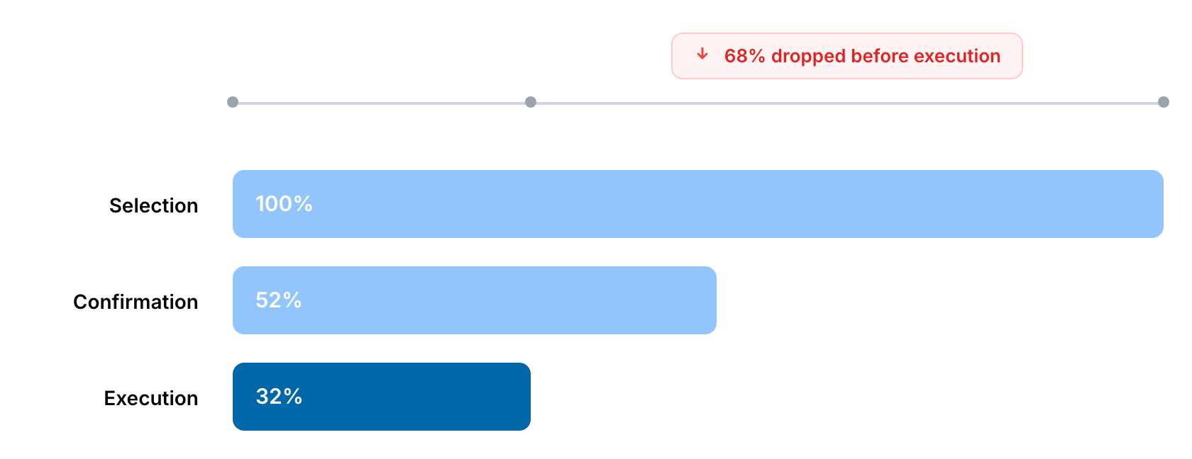
Pre-Execution Abandonment Signal
68% of abandonment happened before any action was triggered, not during execution. This was the insight that shifted the design problem from speed to confidence and became the foundation for the entire design direction.
Selection Transparency Gap
Users explicitly demanded to know what was selected, each item's current state, and what would happen on failure. This transparency need was consistent across all 5 client groups interviewed.
Systemic Pattern Validation
73% of active enterprise accounts showed the same repetitive action pattern, confirming this was not an isolated feature request but a systemic workflow gap across the product.
DESIGN PROCESS
From counterbalanced usability testing to sequencing Phase 2 on the roadmap
The process arc moved from validating the workflow problem, to designing for confidence rather than speed, to testing interaction patterns, and finally to negotiating the technical sequencing that made the solution viable. I tested the floating contextual action bar against a persistent top bar with 8 IT admins in back-to-back sessions one week apart. With only 8 participants, order effects could easily skew the signal. If everyone saw floating first, a preference could be read as familiarity rather than usability. Counterbalancing was the minimum rigor needed to trust the result at that sample size.
Discovery and Research
Conducted 5 structured client interviews paired with usage log analysis to cross-validate that 73% showed repetitive patterns and 68% abandoned before execution
Interaction Design
Tested floating contextual action bar against persistent top bar with 8 real IT admins in counterbalanced sessions one week apart, measuring first-click latency and error rates
Validation Design
Mapped action-severity levels with PM and CS to ensure confirmation flows, warnings, and timing estimates were contextually accurate for each migration scenario
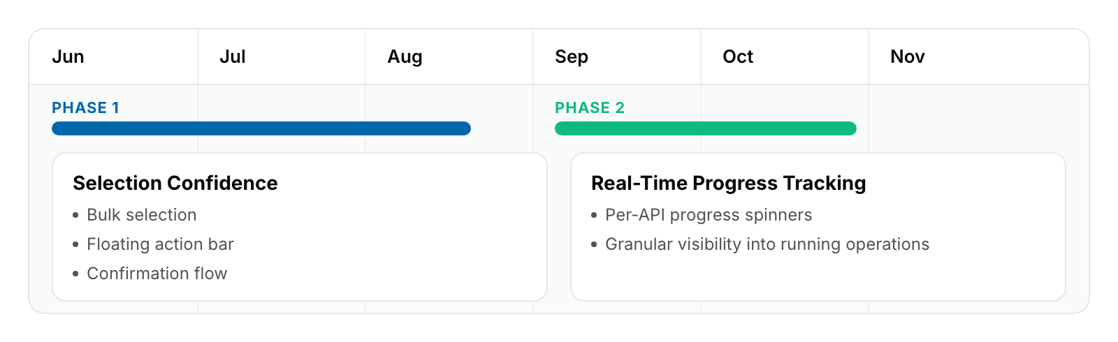
Phased Delivery Planning
Negotiated with the backend lead to sequence real-time progress tracking into Phase 2, solving the higher-cost selection-confidence problem first
DESIGN GOAL
Each funnel gap gets one interlocking part, not a predetermined count
Before drawing any interface, I translated the funnel findings into explicit design goals. The 68% pre-execution abandonment wasn't a single problem. It broke down into three distinct moments where users lost confidence: at selection, at commitment, and at post-execution feedback. The goal was to close each of those gaps with one part of the system, not to hit a predetermined number of components. Starting from the funnel rather than from an interaction pattern kept the solution honest to the data and gave every component a clear reason to exist.
Selection clarity: Users couldn't see what was selected, each item's current state, or what would happen across the batch. The goal here was to make the selection legible at a glance before any action was chosen.
Commitment preview: Users hesitated because execution was irreversible and the consequences were invisible. The goal was to show, before commit, exactly what would happen per action type and how long it would take.
Post-execution feedback: Users had no way to verify what succeeded or why something failed. The goal was to return a transparent per-item breakdown so users could recover without re-running the whole batch.
SOLUTION
Three-part interlocking system, one part per funnel gap
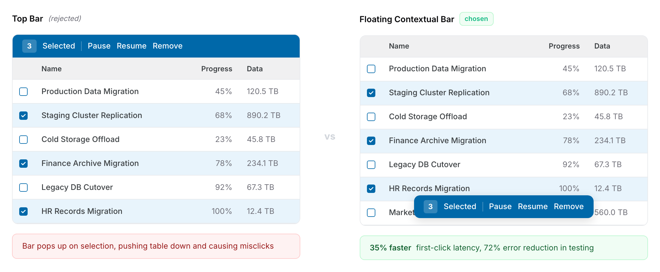
With the three design goals set, I translated each into a concrete interaction pattern. Checkbox selection integrated into the existing Komprise table pattern to minimize the learning curve. The floating contextual action bar addressed both selection clarity and part of the commitment preview goal: I used Jira's responsive-width and overflow-menu behavior as a benchmark, then customized it for our mixed-state requirement where action availability depends on the combination of selected item states. In counterbalanced testing it proved 35% faster on first-click latency and reduced errors from 22% to 8%. The confirmation flow then closed the commitment preview goal by showing selected items, current states, action-specific warnings, and estimated completion time. For Phase 2, per-API progress tracking via individual spinners in the bulk action popup closed the post-execution feedback goal, delivering the real-time visibility users had originally requested.
Floating contextual action bar that appears only when selections exist, built on Jira's responsive-width and overflow-menu pattern, 35% faster first-click latency and 72% error reduction compared to persistent top bar, and dynamically adapts width to preserve table density
Confirmation flow displaying selected items, current states, action-specific warnings, and estimated completion time to build selection confidence before execution
Phase 1 aggregate progress bar plus Phase 2 per-API progress tracking, delivering real-time visibility the following quarter once backend infrastructure was ready
KEY DECISION
I proposed sequencing user-facing confidence ahead of backend infrastructure, with Phase 2 locked on the roadmap before Phase 1 shipped
The hardest decision behind the three-part system was resequencing real-time per-API progress tracking into Phase 2 instead of delaying the entire feature. The engineering lead initially preferred waiting until backend infrastructure was ready so everything could ship at once; their argument was technically sound. The PM was in between. I presented the 68% pre-execution funnel data to reframe the conversation away from "is this feature complete" and toward "which problem is costing us more users today." 68% of the cost sat in pre-execution, where no backend work was required. The key to securing buy-in was committing to lock Phase 2 on the roadmap before shipping Phase 1, so engineering's work was not cut, just sequenced. This was resequencing based on data, not descoping.
OPTION A
Real-time progress tracking would require backend infrastructure that didn't exist, creating a hard delay on the entire feature
68% of abandonment happened before execution, meaning selection-confidence was the higher-cost problem to solve first
OPTION B / CHOSEN
Phased sequencing gave users immediate workflow improvement while backend infrastructure work proceeded in parallel, with Phase 2 shipping the following quarter
Locking Phase 2 on the roadmap upfront converted the scope discussion into a product sequencing decision rather than a compromise
CHALLENGES & TRADEOFFS
Designing action visibility and severity rules for mixed-state selections
The trickiest design problem inside the floating bar was deciding which actions to show when users selected a mixed set of item states. When a user selects 15 migrations and 3 are Running, 5 are Paused, and 7 are Completed, which action buttons should appear? My initial design showed only actions applicable to all selected items. But in mixed-state selections, almost every action became inapplicable to at least one item, so nearly all buttons disappeared. Users reacted with confusion: "I selected 15 items, why can't I do anything?" This was a critical failure because it punished users for selecting more items, which is the exact opposite of what a bulk action system should encourage.
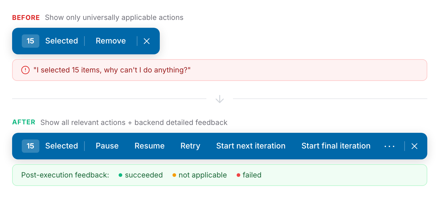
I pivoted to showing all actions that apply to any subset of the selection, making every relevant action visible regardless of state mix. The key decision was pairing this with backend detailed feedback after execution: instead of blocking mixed-state actions upfront, the system executes the action and returns a transparent breakdown of which items succeeded, which were ignored (incompatible state), and which failed with specific reasons like "source path not accessible" or "connection interrupted." Users can then deselect the successful items and retry only the failed ones as a new bulk action, turning a potential dead-end into a clear recovery path.
I also mapped warning severity across action types with PM and CS so confirmation tone matched consequence: Remove used irreversibility language in a prominent warning, Pause used a lightweight confirmation, and Start Final Iteration used a detailed explanation of what happens to in-progress data. I documented the resulting action-state matrix as a reusable specification, mapping every combination of action type and item state to an expected outcome. The matrix was reused directly when bulk actions expanded to archival and tiering tables later that quarter. Those teams defined their own action-status combinations but adopted the same UI pattern and feedback system without modification.
IMPACT
Workflow efficiency and confidence gains exceeded targets, validated against a stable 6-month baseline
TASK COMPLETION SPEED
+90%
Exceeded the 80% target, from 30-40 minutes per session to under 5 minutes
BULK ACTION ABANDONMENT
-95%
Dropped from near 70% pre-execution abandonment to 5% post-launch, well below the 20% goal
CS ESCALATIONS
-62%
Migration workflow tagged tickets decreased over 8 weeks post-launch, validated against stable 6-month baseline with other categories flat
Task completion speed improved by 90%, exceeding the 80% target. Bulk action abandonment dropped to 5%, well below the sub-20% goal. CS escalations tagged to migration workflows decreased by 62% in the 8 weeks following launch. To confirm the drop was actually attributable to this feature and not a coincidence, I worked with the data team on a three-step attribution check: isolate tickets tagged with a consistent "migration workflow" category, compare the 8 weeks post-launch against a stable 6-month baseline, and verify that other ticket categories remained flat during the same period to rule out product-wide shifts. All three checks held. The phased approach proved correct in the usage data: users responded to the workflow improvement immediately, even before full transparency shipped, validating that entry-point confidence was the higher-priority problem.
LEARNINGS
Behavioral data beats stated needs, and involving engineering earlier would have saved a mid-project renegotiation
The biggest lesson from this project was methodological: stated needs and behavioral data are two separate inputs, and the gap between them is where the real design problem usually sits. Users told us they wanted faster bulk execution, but the funnel showed the real need was pre-execution confidence. I had seen the same pattern in the Data Tagging System project at Komprise, where users asked for faster filters while behavioral data showed they were rebuilding the same filter combinations 4.2 times per session on average. In that case the real need wasn't speed either, it was a way to save meaning, which led to a tagging system instead of filter optimization. Both insights came from the same discipline of trusting what users do over what they say, and I now treat that gap as the first thing to resolve in any discovery phase.
The related lesson was that phased delivery is a design tool, not a compromise. Before this project, I assumed phasing meant shipping an incomplete product. Users tolerated the absence of real-time progress tracking because removing 40 manual steps per session was immediately meaningful. The threshold that mattered was not feature completeness but workflow improvement that moved users from abandonment to activation, and phasing turned out to be the cleanest way to hit that threshold first.
The thing I would do differently is involving the backend engineering lead in discovery earlier, before design directions were locked. The Phase 1 and Phase 2 sequencing was the right call, but if I had surfaced the backend constraint in week 2 instead of week 6, we could have planned for it from the start instead of negotiating mid-project. That single change would have preserved the same outcome without the cost of mid-project scope work.
NEXT STEPS
Scaling the pattern and closing the customer feedback loop
The bulk action pattern built for migration has become the foundation for scaling the same experience across other Komprise table surfaces, which was the original system-level intent. The next phase is to systematically extend this pattern to archival and tiering workflows while maintaining the interaction consistency users now expect. Equally important is closing the direct feedback loop with AHEAD to validate that their specific churn risk was resolved and to understand which components unlocked the most value for them.
Extend the bulk action pattern to archival and tiering table surfaces using migration as the proven foundation, maintaining interaction consistency
Establish a direct customer feedback loop with AHEAD to validate churn risk resolution and identify which components had highest adoption impact
Evaluate row-level progress indicators for Phase 2 expansion now that per-API tracking is live, based on real usage patterns across migration, archival, and tiering
Document the phased delivery approach and technical sequencing process as a team standard for future enterprise features requiring infrastructure parallelization